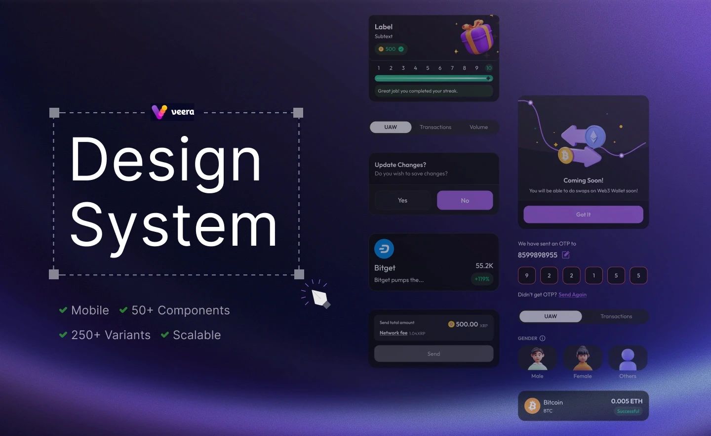
Building the design system for Veera mobile experience
Role
Product Designer
Scope
Audit
Component library creation
Design tokens setup
Guidelines for usage
Handoff for developers
Duration
8 weeks +
Team
2 × Product Designer
1 × Product Manager

Design tokens are the core style values like colors, typography, and spacing that ensure consistency.

The smallest UI elements such as buttons, icons, or input fields.

Simple groups of atoms working together, like a search bar with an input and button.

Complex components made of multiple molecules, such as a header or card.

Final instances of templates filled with real content and data.
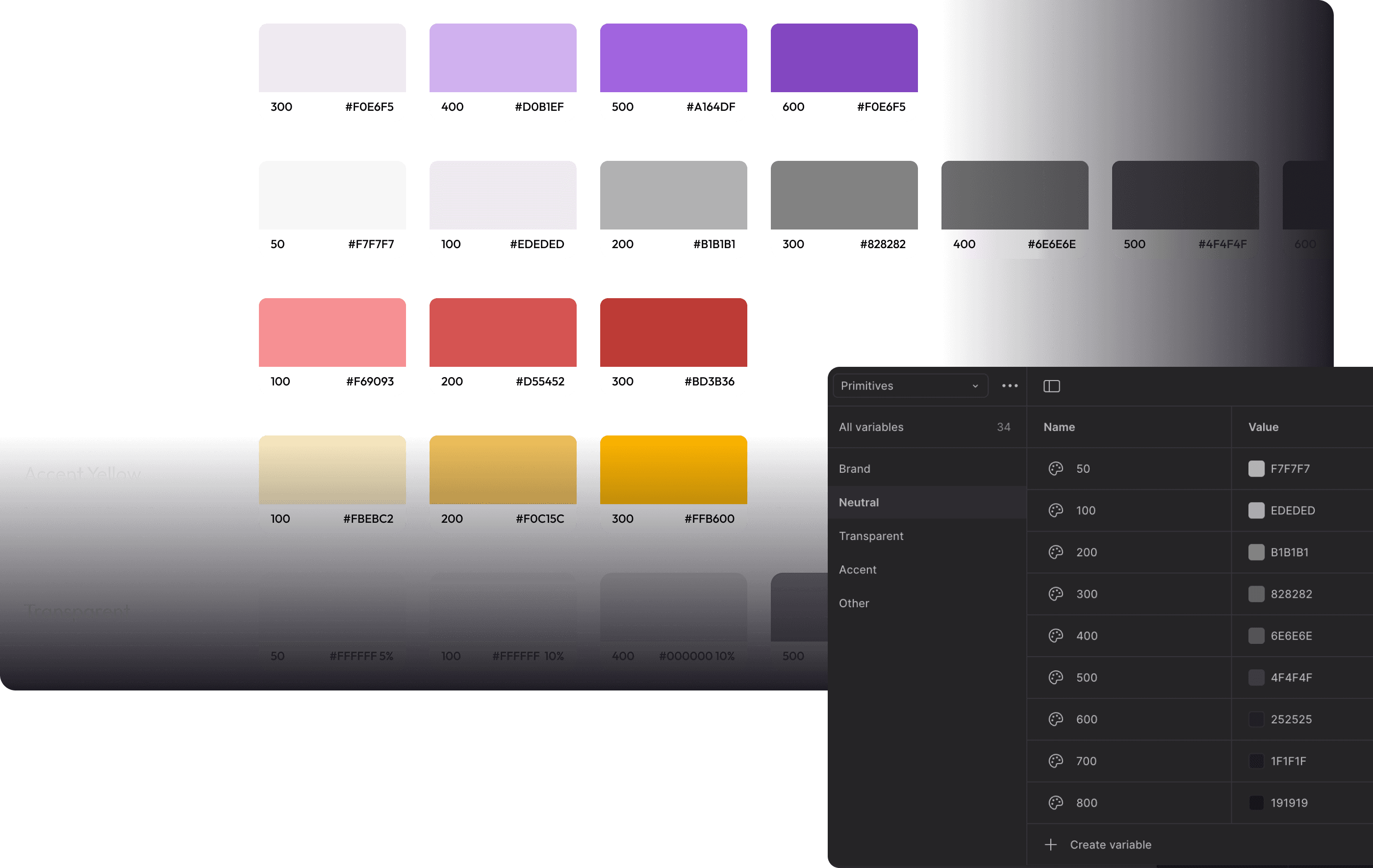
Tokens

Color
Defined the brand palette and established visual hierarchy.
Typography
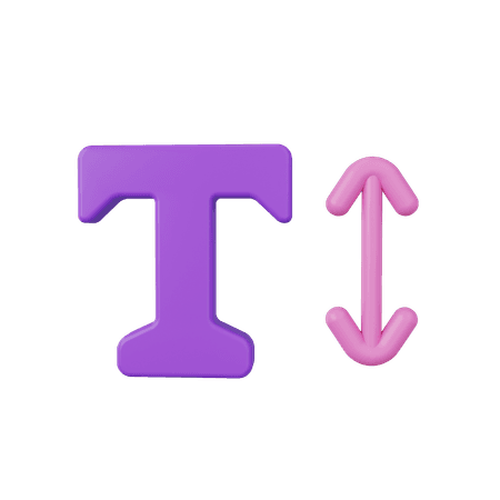
Set up scalable text styles to maintain readability and tone.
Grid
Designed action elements that were clear and impactful.

Icons
Created a visual language that improved recognition and navigation.
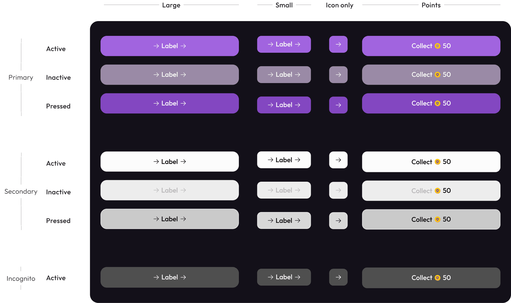
Components

Buttons
Designed action elements that were clear and impactful.

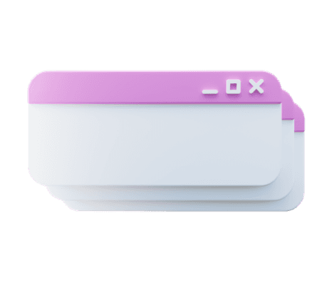
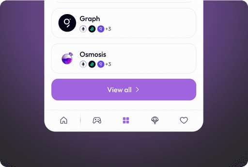
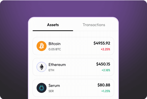
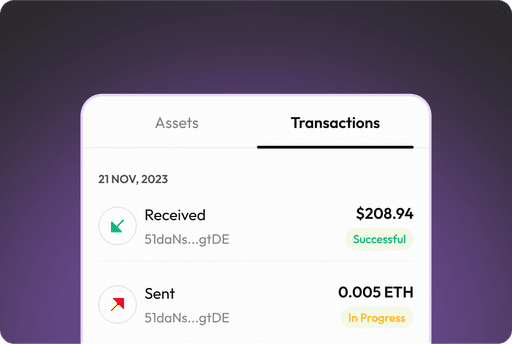
Cards
Grouped information in a structured and scannable format
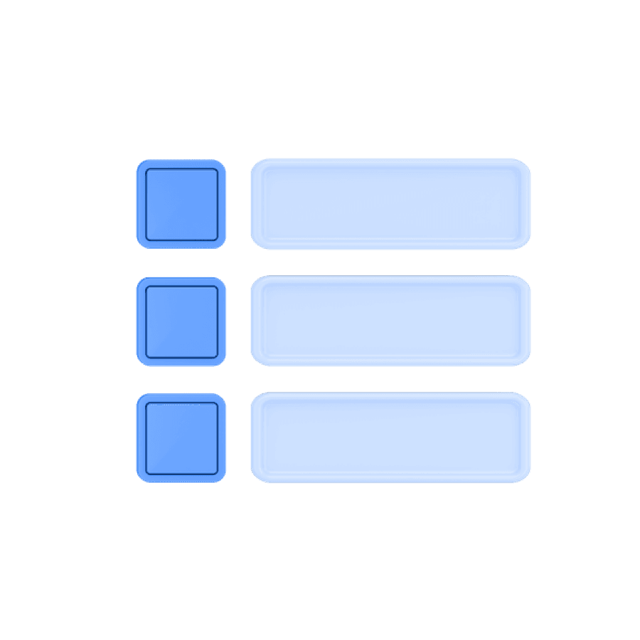
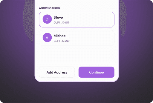
List
Organized layout for easier comparison and selection

Dock
Introduced fixed navigation for quick access to core features.
Tabs
Enabled smooth switching between related views.
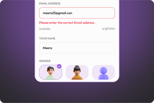
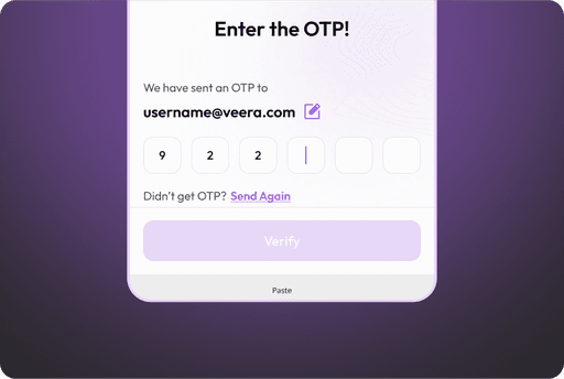
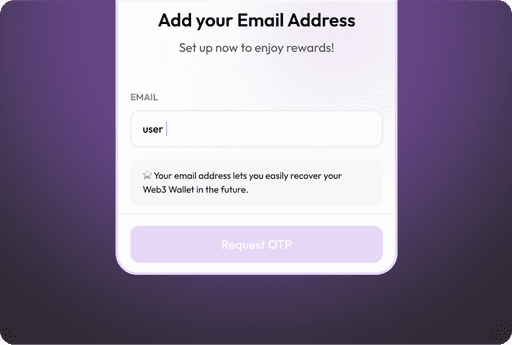
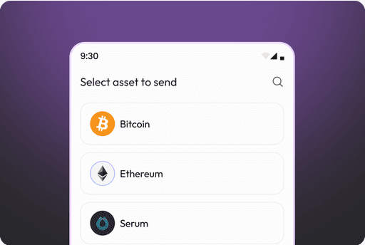
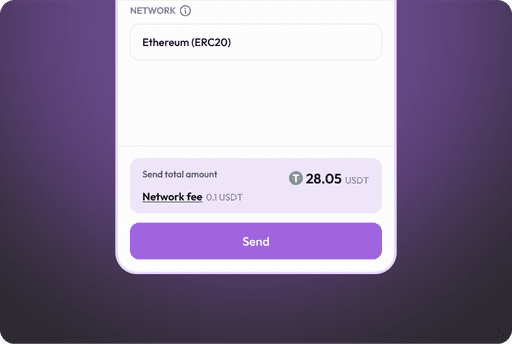
Input fields
Designed input areas that captured user data effectively.
Foundations
Colors
Typography
Grids
Icons

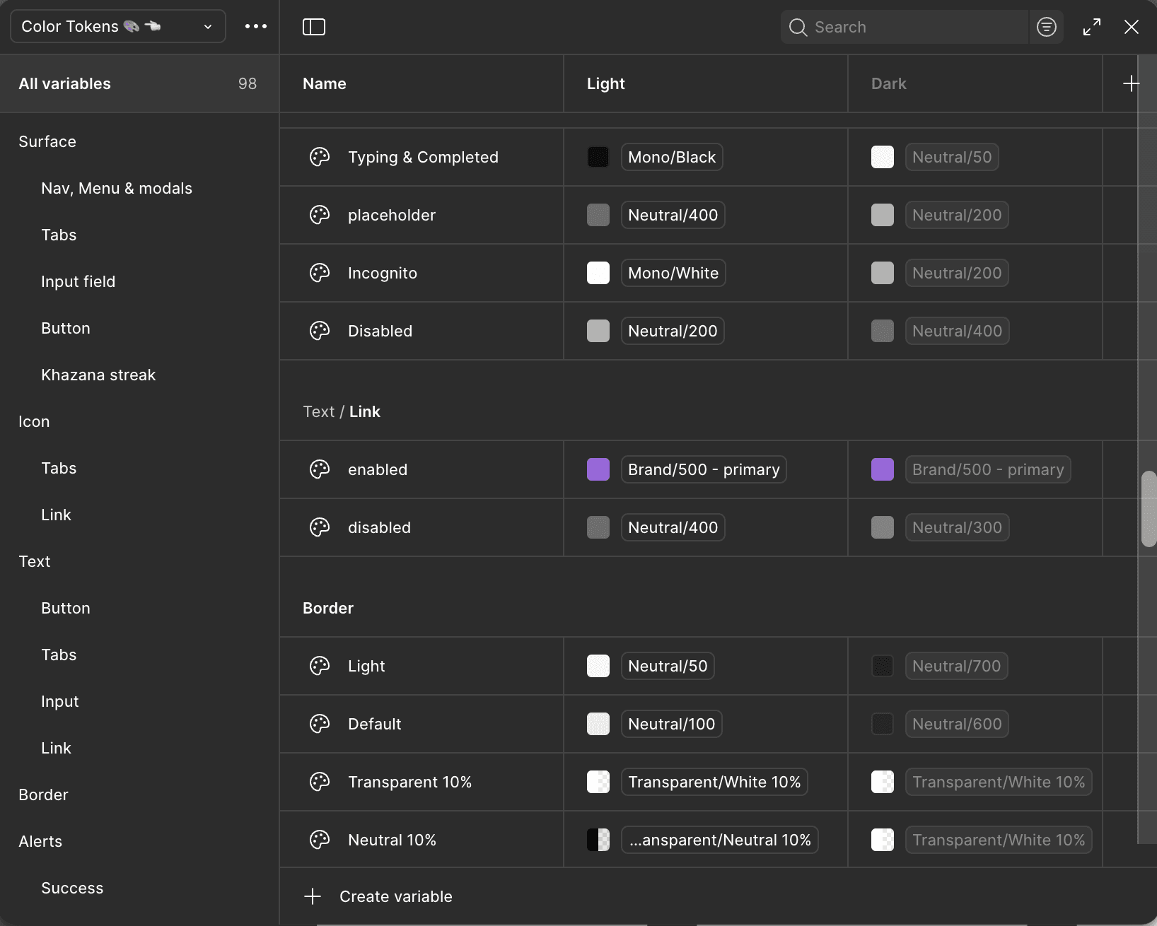
Surface
Text
Icons
Borders
Alerts
Color tokens were created to maintain consistency across surfaces, text, icons, and alerts in both light and dark modes. By defining reusable variables, the system ensures scalability and adaptability while keeping the brand identity intact


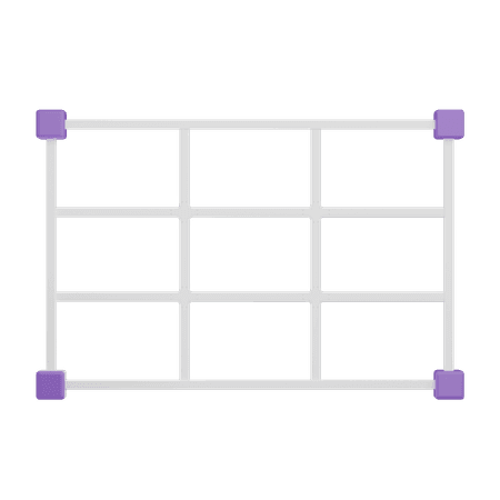
Grid
4 column grid system is used with 16PX margin from both the sides. Along with this, horizontal grid is also added to maintain 8PX grid system throughout the app.
Screen size used here - 360*800 PX
Flat icons
Colored icons


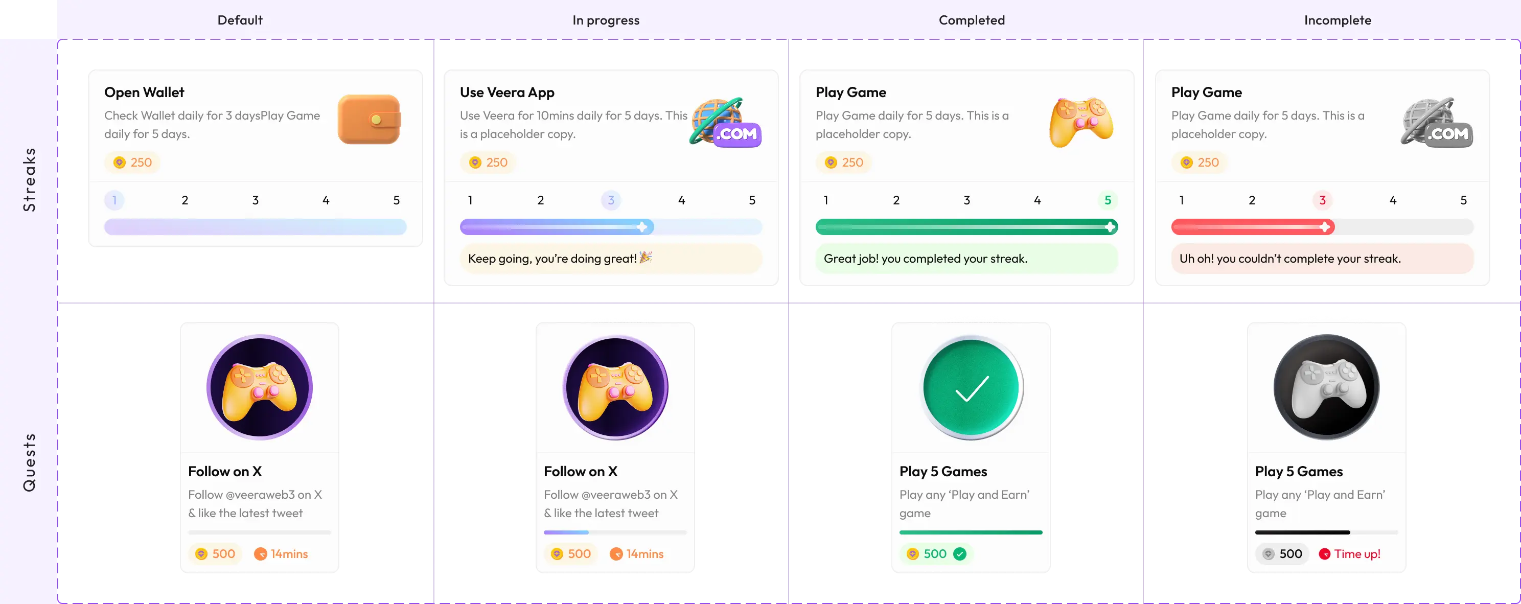
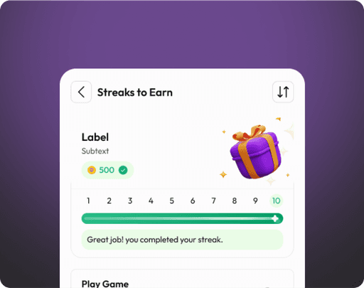
Components
Buttons
Cards
Lists
Input fields
Bottom dock
Tab bars
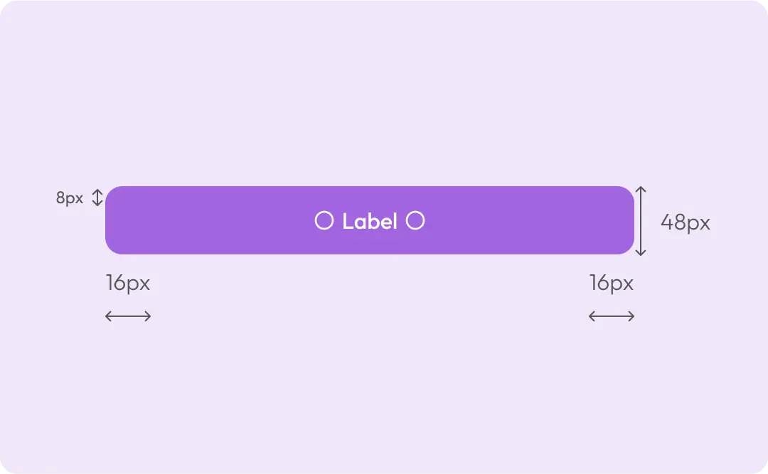
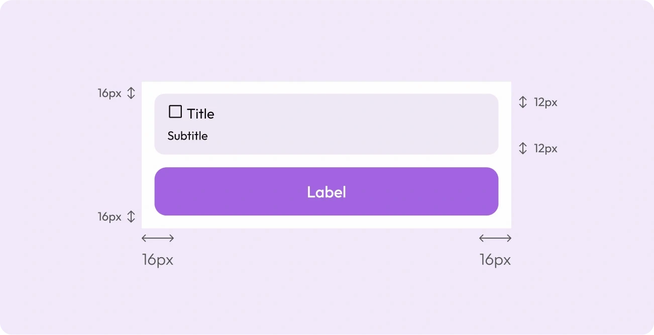
Size and spacing
Height:
Border radius:
Padding.top, padding.bottom:
Padding.left, padding.right:
Gap:
48,40px
12,8px
12px
16px
4px

Size and spacing
Height:
Border radius:
Padding.top, padding.bottom:
Padding.left, padding.right:
Gap:
72px
16px
12px
16px
8px
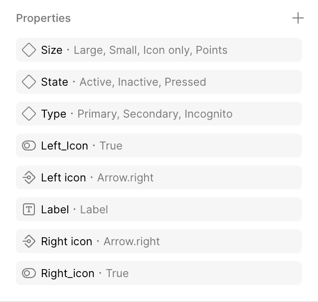
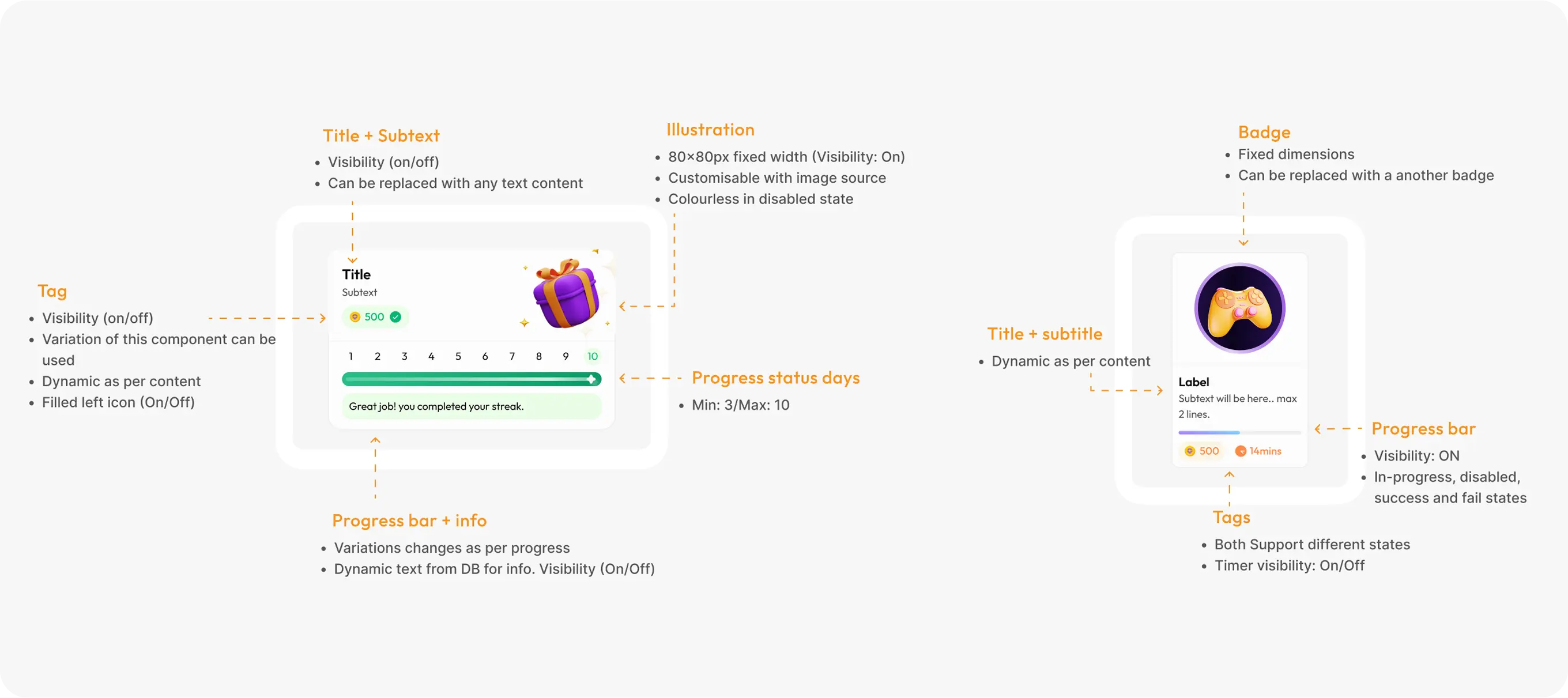
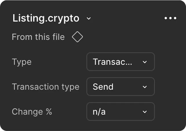
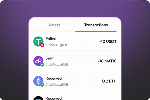
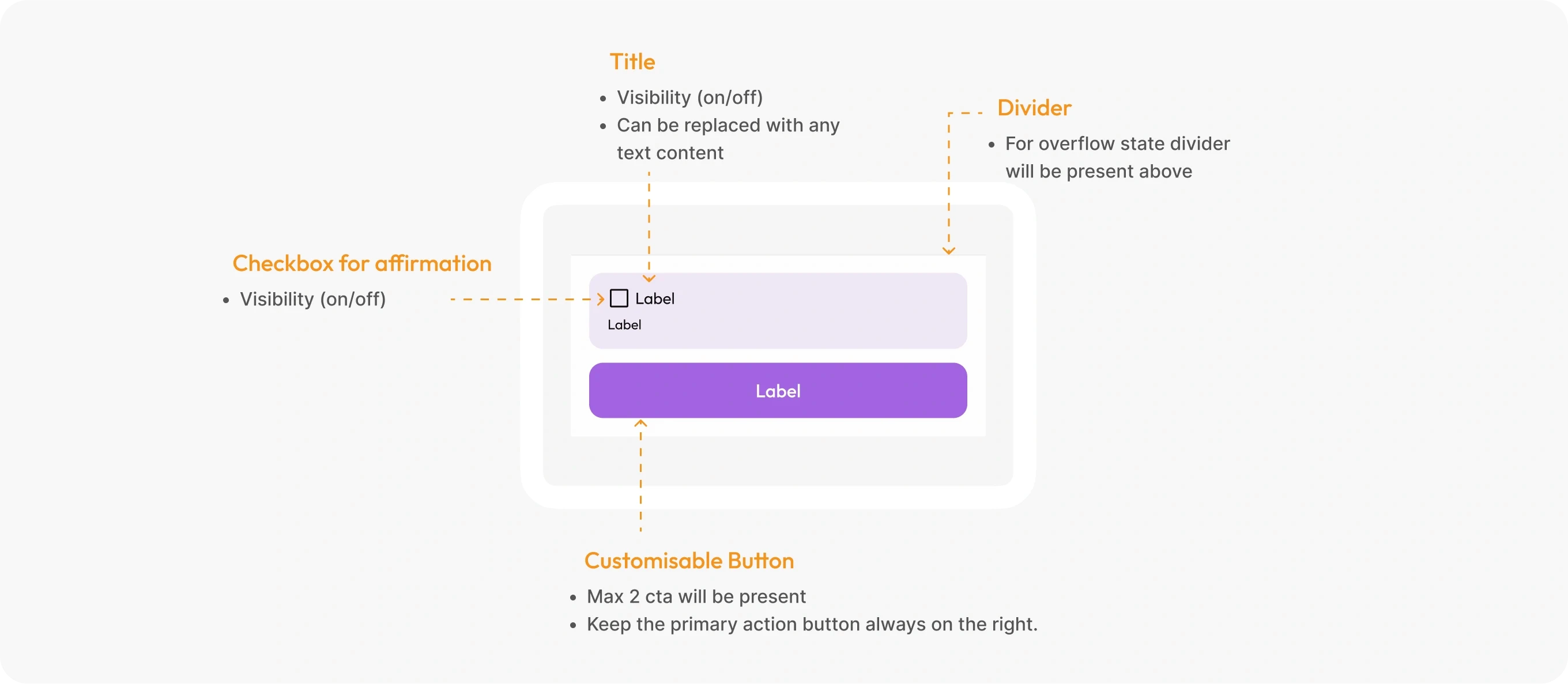
Anatomy
Style:
Transaction Type:
% change:
Transactions, Assets
Sent, Sending, Received, Failed
Positive, Negative
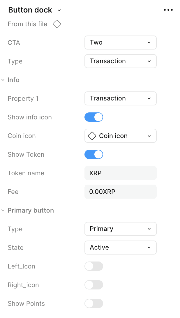
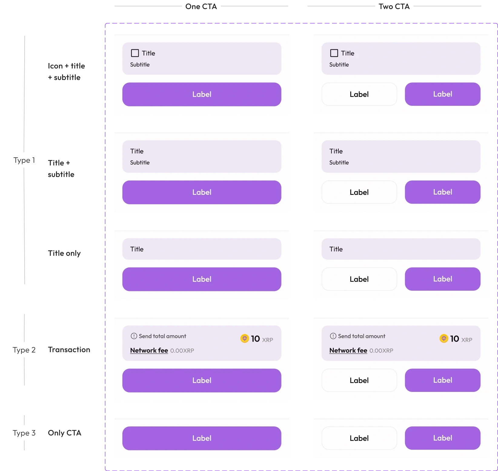
Size and spacing

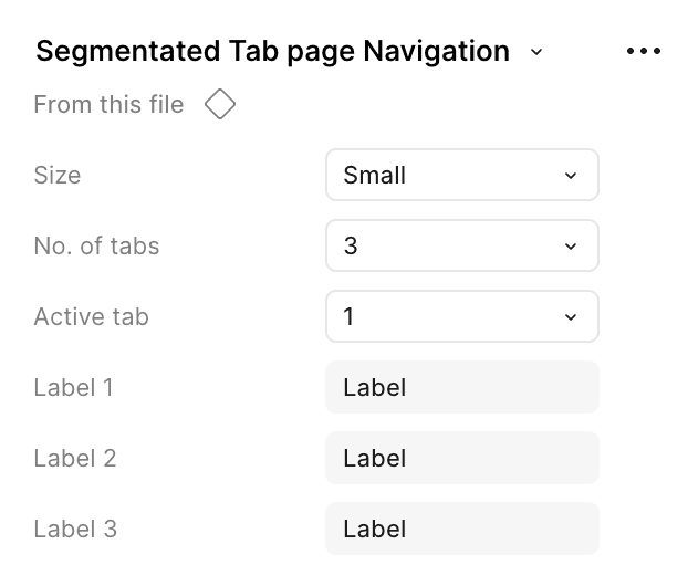
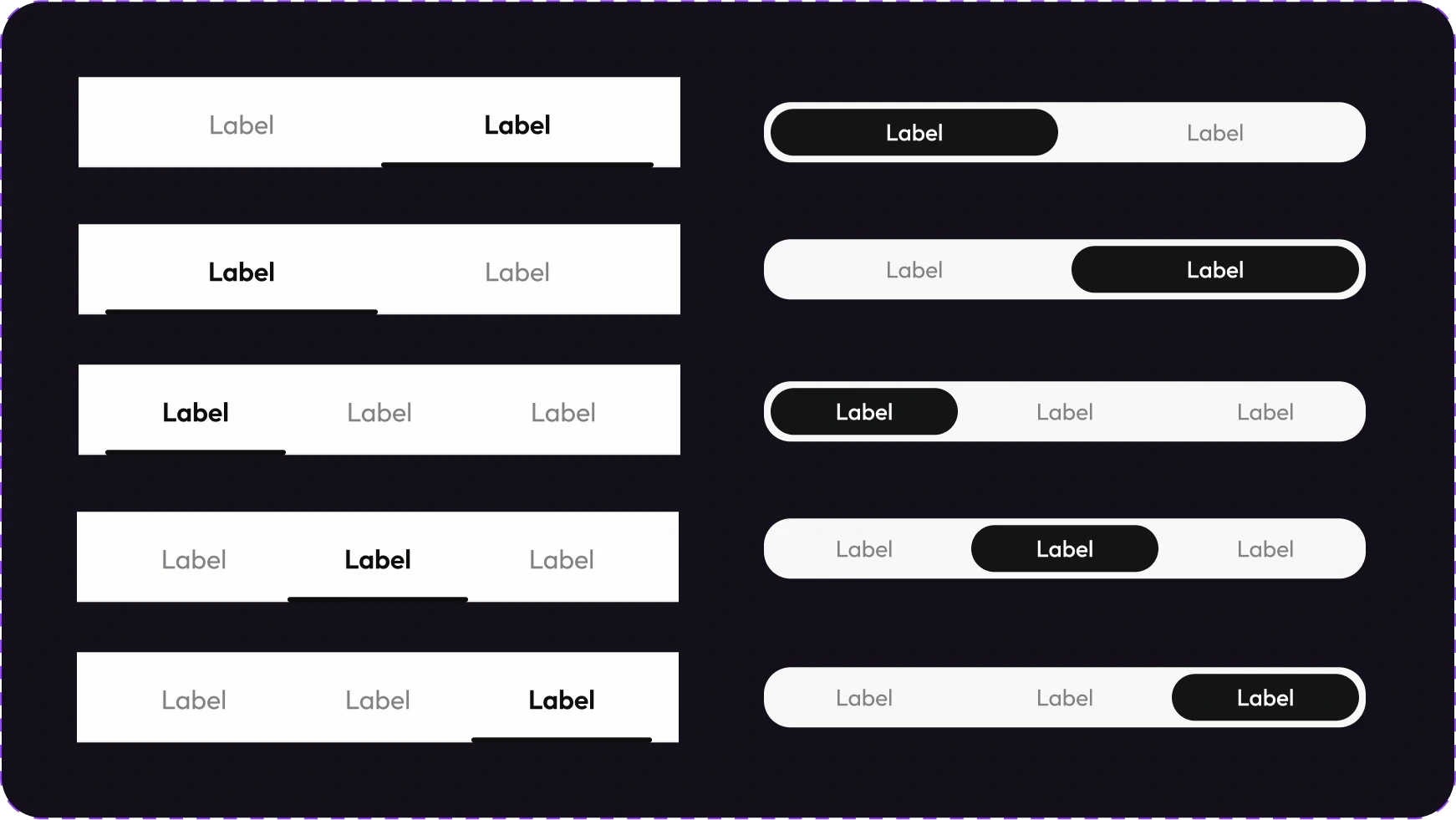

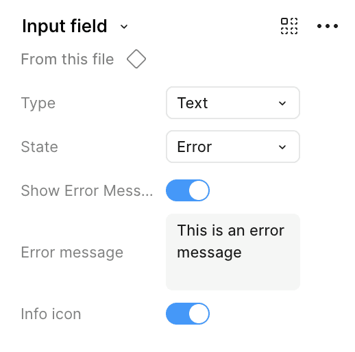

Anatomy
Type
States
Info Icon visibility

Use cases